Making the Notes App look like a real notebook is an error.
The first time I used an iPad I lauched the Notes App. And I saw this is not just a yellow page with lines. There is a fine border of leather near the edge, and the background in not really yellow.
Just to make it look like a real notepad. Wrong.
I checked on iPhone : same thing. It looks like a real notepad.
What’s the problem with that ?
1. Same appearence does not means same interaction
 What I like with real notepad is that I can write stuff on it. I don’t buy notebooks (and I use a lot of them) for the look of it. I just want to write on it.
So with this application I should be able, at least, to write on it, not look at it’s appearance.
But you could say : this is not a problem, if the application lets you use it like a real notebook, the fact that it looks like a real notebook is a bonus.
Right. But you can’t use it like a notepad. So why look the same if you can do less ?
I was not honest when I said I just want to write on a notebook. I also would like to DRAW. This I can’t do. The application looks like a notebook (useless), I can’t write on it (serious limitation).
My impression would not be the same if it didn’t look like a notebook and I could not draw on it. Would have been a simple text note app.
2. Softwares are a chance to get rid of physical limitations, not copying them
When I use the application, I want to do more than with just a simple notebook. I also want it to resolve some real life constraints. Otherwise I’d use my real notebook.
What I can’t do with a real notepad that Notes is doing :
- No need for a pen, just use my hand : OK
- Share my notes : OK
- Copy/Paste : OK
What I can do with a real notepad that Notes is NOTdoing :
- Put a picture in my note
- Draw
My point is : there is a gap between what an application can do and what it looks like. So don’t use paradigm that are too old or uncompleted. Just do something else.
Software should be inspired from the reality but being able to do at least the same. Not less.
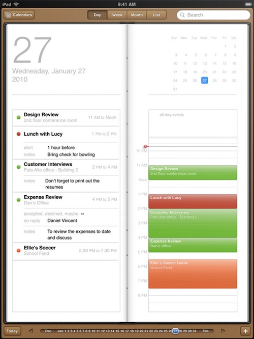
I had the same problem with Calendar on iPad : what bothers me in the reality (the margins and the page junction) is still here ! Just to make it look like a real agenda.

Same idea with BumpTop : it’s based on what bothers me a lot : gravity. Now I must fight against gravity in my computer too.


