I just finished reading the inspiring book “Scaling Lean and Agile Development” by Larman and Vodde.
Continue reading “Scaling Lean & Agile Development : Recommended Reading List”
Software Engineer and Product Manager
I just finished reading the inspiring book “Scaling Lean and Agile Development” by Larman and Vodde.
Continue reading “Scaling Lean & Agile Development : Recommended Reading List”
If your app is for a team of users, don’t focus on the app nor the users. Focus on not impeding their interactions. Don’t forget they can talk to each other and think on their own without your app !
If your app is for a team of users, don’t focus on the app nor the user. Focus on not impeding their interactions. Don’t forget they don’t need your app to talk together. They are already doing it. Worst : don’t try to replace live interaction with electronic processes. It’s best for them and cheaper for you.
It was a shiny day of July, the meeting was 3 hours long. The goal ? Prioritizing, specifying and poker planning the next sprint. We made the mistake of scheduling it right after a 8 hour meeting with our key users (sort of day-long presentation/feedback of our latest monthly release). Now we were embarking on the next sprint. We were exhausted and really focused on details.
Examining story after story, we were fighting to make them all fit in the sprint. First mistake.
Second mistake : focusing too much on each story at a time. Loosing the big picture.
The third mistake needs a little back story.
Our application’s goal is to help people who already work closely together to do so with a tablet. They already talk to each other, they are trained to work together. They work this way since 1933 at least.
The user stories were about helping the team leader to distribute roles in his crew. Simple in appearance…
It’s was a nightmare of story dependencies, complex vague specifications, really expensive features.
Why ? We forgot the people the leader has to manage are physically in the room during the use of the feature. Hence all controls, feedback, error-prone specifications we were trying to establish were useless.
Simply by TALKING to each other, the users could work together. We forgot that since the begging. Focusing more and more on the new tool we were building, we forgot the primary human tool : talking.
We saved our velocity and the project budget. But the danger is still around. Don’t forget the most basic human skills instead of trying to replace them all in one app.
If you still speak about features, or plan to add another sprint to “finish” the backlog : you are not Agile.
On some Agile projects I’ve been working on I noticed an arch reality :
If you still speak about features, or plan to add another sprint to “finish” the backlog : you are not Agile.
One of the first warning I give a new client about Agile projects is the following : your backlog is not a magical whishlist. You can have :
but if you still think the team will finish all your User Stories at the end of the last sprint, you’re gonna have a bad time.

No. Certainly not. It’s a reality call : if you don’t have enough money to build all you have in mind, you won’t.
And you know what ? It’s a good thing ! Features are not the goal of all this sprinting. It’s about VALUE.
Your backlog is not final. It’s a moving plan. It’s a goal. And User Stories are certainly not features. A US can be composed of many features. Or none sometimes (just a simple analog solution)
There will be delay and lag. Even in Agile of course. And the solution is not to do another sprint. It’s to cut down the number of features and start concentrate on what is really meaningful to users.
If you think I’m to vague start looking a the best product out there : less features but an immense value each time you use it.
Maintenance is a part of your software value. It has a cost, it represents a debt.
So some final word of advice :
Have some budget dedicated to dismount or erase some features. It increases software quality (with less code base) and increases its value (more stable, less feature creeped soft).
While trying to add Korean support to the Wifinsite app, I ran in the following problem : the app stays in english. French was ok, but no Korea.
Actually you have to add 2 Korean languages : ko(korean) and ko-KR(South-Korea). Very disturbing.
PS/ Sorry for the short article. I’ll post a detailed tutorial if needed.
For example when starting new projects as PM. I usually restart my tracking of all the moving pieces with a blank wiki page and spreadsheet.
In theory I could use tools on the market that help manager features, teams, requirements, goals, experiments, …
Without buying anything outside, I could re-use my own work as template.
But none of this offer the pure benefit of thinking. Asking the right questions is much more important than getting a pretty ready made gantt.
Questions like:
On my last growth oriented project, I built a first tab to track what we were building. Then I needed a higher level, so I built a new tab with only weeks and not days. Later on I needed to store the results of AB tests.
As I added clutter, I stopped synchronizing my tabs. Some of them inherited the prefix “(Deprecated)”. And I knew I was still looking for the right way, for that particular project, that audience, under those circumstances.
Some day I’ll choose a tool that suits me. When I do, I will know what I want and how I want to use it. No the other way around.
It is the same in any endeavour: architecture, writing music, programming, writing fiction, …
Build your own tool and template in your mind only. Then manually scale up as the project goes along. And keep trimming, keep going back to the essential.
On collaborations you may not have the choice of starting from scratch your follow up and documentation though.
But most importantly on collaborations: you need to get feedback about what you write and measure and how you present it. You are rarely alone.
Nowadays spreadsheets can show you what other users are doing live. Use that knowledge to observe when people concentrate their attention.
For my current project, in the morning, the spreadsheet was empty. No one connected. Then during a retrospective, without explicitly telling it, the team mentioned the lack of vision and clear roadmap. For me it was already there! but it was too complex.
As soon as I simplified, started from scratch the tracking (with the same content in the end), I saw a spike of usage in the spreadsheet. I saw engineers following each line while we where doing the scrum on Slack (ha yes, because of the Corona Virus in Korea these days, lots of us a remote, and that’s a great way to realize a company limit when it comes to remote-ish work)
The other day I tried to buy a ticket on koreanair.com. I had to try 31 times to achieve the transaction.
Here are the ordeal I encountered.
First of all : the Home page. Or should I say : one of the numerous home pages. There are so many ! Home page when you are logged, home page to select your country (which should be automatically detected, come on in 2010 !), home page in Korean when you encounter an error ! Great.
You must put one and only one page in you site you Korean Air people. And please, don’t use 2 home pages with just 2 pixels and a combo of difference.
Maybe you would say : “OK, I’ll copy/paste the url and try to put it in Internet Explorer or Firefox or Safari or Chrome or Opera.” Fail ! Copy/paste does not give you a valid URL. It seems to be randomly generated to put you back on the one of the home pages.
Some buttons and some texts are images ! So if they are not translated from Korean, you have a chance it stays in korean even if the page is in english. Texts are horrible but it seems like korean websites use them an awful lot to create pixel-precise pages. Go away you semantic web, we don’t need you !
One of the thing you don’t want to happen when your are manipulating real plane tickets with real money is server errors. This is what happens. Is my money transfered ? Are my tickets issued . No way to say because :
This is true, I don’t like to know if my transaction worked, if my credit card number if securely transmitted. I don’t care ! I prefer pink heart floating away.
I’m a little harsh with them : there are informations. Many, many informations. But not the one I need !
At the end of a lost request please meet Useless-Support-Girl. She will be very pleased to tell you the phone number you cannot call to have no information.
If you try to print the source code of some pages, you will see code comment dated of 2002. Wow, was it HTML 1 or HTML 1.8 at the time ? Don’t look for AJAX. This little snobbish way of doing so-called modern-pages. It’s outdated in 2002. Or at least, not invented yet maybe.
Yes, here they are. Many of them. Frames to avoid loading pages and tables to put stuff in rows. Yes, because CSS is so modern. It won’t be compatible.
One great things about browser is ad blocking extensions and serial popups blocker. Koreanair.com uses popups to inform you about crucial stuff. Bummer. Please turn off this horrible feature. And you will be able to nearly try to maybe buy a ticket. Otherwise “ya dun goof‘d” man.
You know what ? Internet Explorer is maybe the only browser used in Korea. Google Chrome ? Firefox ? What’t that ? We don’t need it. Our code is IE 4.3 fully compatible.
Thinking like a technology engineer (juste being IE compatible in 2002) makes bad UX.
Not thinking about the technology (putting great graphics but with no code evolution perspective) makes bad UX too.
You’ve got to consider both. Put a designer and a programmer in your team. Make them work together. Not one after the other.
Korean air is not really a nightmare of graphism and color, but truly of experience. Things seems right at a glance. But when you click and use it seriously it’s just impossible.
And you know what ? I tried to buy a tickets to it’s competitor Asiana. Same problem ! Do you believe it ?
Have a look at the following picture.

Now tell in which street I am: the first one on top and going to the one above ? Or the other way around ? (Think that you must look at the road while doing this of course.) For me it’s impossible.
The problem is : there is no universal convention to indicate going from a point to another. They could have used an arrow for example.
Also missing is the name of the city I’m in. I needed this information during a lot of occasions.
So before even thinking of putting TV on my GPS or Heads Up Display (which would rock !) : just make a good UI first.
Making the Notes App look like a real notebook is an error.
The first time I used an iPad I lauched the Notes App. And I saw this is not just a yellow page with lines. There is a fine border of leather near the edge, and the background in not really yellow.
Just to make it look like a real notepad. Wrong.
I checked on iPhone : same thing. It looks like a real notepad.
What’s the problem with that ?
 What I like with real notepad is that I can write stuff on it. I don’t buy notebooks (and I use a lot of them) for the look of it. I just want to write on it.
So with this application I should be able, at least, to write on it, not look at it’s appearance.
But you could say : this is not a problem, if the application lets you use it like a real notebook, the fact that it looks like a real notebook is a bonus.
Right. But you can’t use it like a notepad. So why look the same if you can do less ?
I was not honest when I said I just want to write on a notebook. I also would like to DRAW. This I can’t do. The application looks like a notebook (useless), I can’t write on it (serious limitation).
My impression would not be the same if it didn’t look like a notebook and I could not draw on it. Would have been a simple text note app.
When I use the application, I want to do more than with just a simple notebook. I also want it to resolve some real life constraints. Otherwise I’d use my real notebook.
My point is : there is a gap between what an application can do and what it looks like. So don’t use paradigm that are too old or uncompleted. Just do something else.
Software should be inspired from the reality but being able to do at least the same. Not less.
I had the same problem with Calendar on iPad : what bothers me in the reality (the margins and the page junction) is still here ! Just to make it look like a real agenda.

Same idea with BumpTop : it’s based on what bothers me a lot : gravity. Now I must fight against gravity in my computer too.

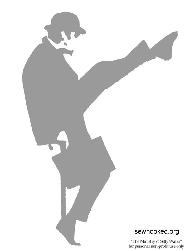
Here is a wonderful conference by John Cleese at the World Creativity Festival.
When it comes to entrepreneurship, screewriting or engineering (3 of my passions) the problem is the same : creativity is nothing magical. You don’t need to be an artist living a Boheme life, drinking all day long, never cutting your hairs. There are methods and ways to improve your creation and find idea.
To summarize :
Did you test this method ? After struggling hours on a problem : the solution comes when leaving the problem alone. It’s because you let your mind relax and find new inspiring idea. That’s great, however it doesn’t work every time.
I liked the remark about today’s life : we are over-busy. So we never let our mind wander around. Hence we never feed our brain with new element to build idea upon.
Obvious but so true : a phone ringing, a mail coming when your debugging, writing, or creating a new product specifications, is terribly disturbing. Sometimes you don’t even notice. Resuming an interrupted creative session is painful.
Obvious again but so hard to do. The best place where creativity came to me was in parks alone on a bench. You must define a start and end time : to make this work session a special moment in your day. Very hard when you share office with someone.
My only regret is that he does not talk about group creativity, because Monty Python individually talented people grouped together.
And you ? How do you find new idea when you need them ? Where is your oasis, the place where your go to be undisturbed ?